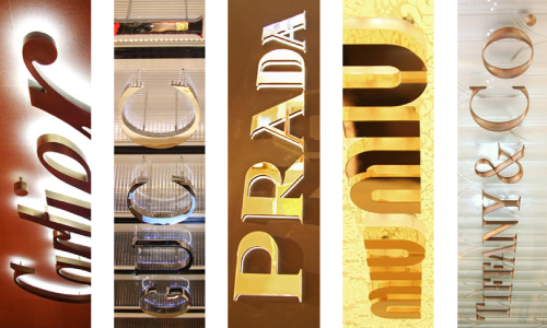
During a recent visit to the Wynn Casino in Macau, I couldn’t help to take a closer look at the signage of high-end shops including Cartier, Gucci, Prada, Tiffany & Co and Miu Miu since I was recently commissioned to create one as well.
It wasn’t the the first time I walked by these shops but I never looked at these signage carefully. Each one of them were crafted differently but to perfection.
1. Cartier

Cartier’s logo was crafted out with brush steel in bronze color. The lettering was at least 5cm thick. A soft white light is installed inside the back of the logotype casting a very soft white glow on the wall behind it.
2. Gucci

Gucci’s logotype made use of a super shiny chrome finish done by electroplating. Similar to Cartier’s sign, Gucci have lights buried inside the letters as well. The difference is that Gucci used LED lights instead which you can tell by the dots of light that is reflected off the background wall.
3. Prada

Prada’s signage was very attractive. They used a frosted acrylic backing with a soft glowing light source and then topped it off with a shiny gold finish on the front. The result was classy as it shines bright on the outside and glows even brighter on the inside.
4. Miu Miu

Miu Miu’s signage was very similar to Prada’s. They also used a gold chrome, frosted acrylic and LED lights. Similar with material but different in style. Miu Miu added more flare to their sign. They made use of a floral pattern background and the sign is at least twice as thick as Prada’s sign.
5. Tiffany & Co.

Tiffany & Co. really stood out from the crowd for me. It is elegant! No fancy lights or shiny finishing. They made an embossed version of their famous logotype out of solid brushed steel attached to the glass window outside their store. The glass behind the signage had a simple sand blasted pattern on it making the signage even easier to focus. It kept the signage away from the distractions inside the store.
Summing Up
Looking at 5 top luxury brand signs, they share 4 common points:
- The Sign design is bold and simple
- They all use a metallic surface
- They all have a substantial thickness
- Back Lights and background patterns are used to enhance the sign even more
Now here is the finished 1.2 meter wide Shengbida Toy logo signage that I was commissioned to create. Although it isn’t as hi-end or shiny as the above examples, the cost of this logo is a lot less as well for sure. So considering the cost and the result, this was a job well done! It is now installed at the office entrance on a light blue wall. Click here to see more images of the sign installation and the finished entrance.


