Sample Signature Gallery
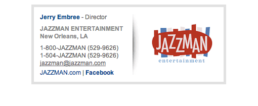
Image on the Left ***Click on image to see sig design***
Perhaps the most popular layout option. We read from left to right so starting the statement with a visual on the left then moving onto the info on the right makes sense and feels natural. When designed with essential info only, the design is usually narrow and is more optimized for mobile devices.


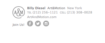


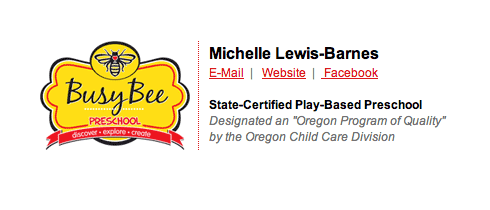
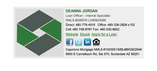
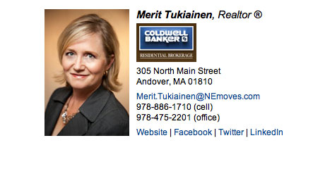
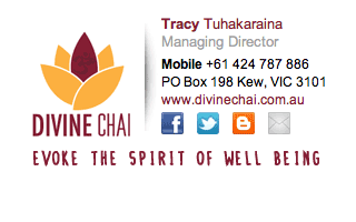
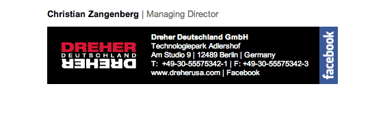


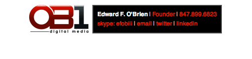
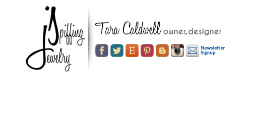
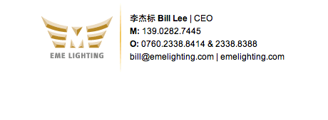
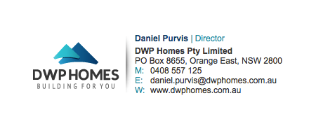
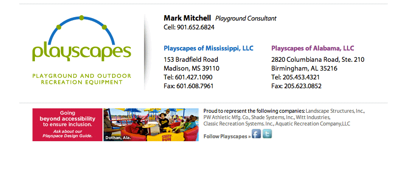
Image on Top ***Click on image to see sig design***
Image on top, info on bottom is a great option to keep the design tight, small and modest. The layout is usually narrow since the info flows to the next line instead of to the right. Keeping the design layout narrow ensures better consistency when the email signature is viewed on smaller screen or mobile devices.


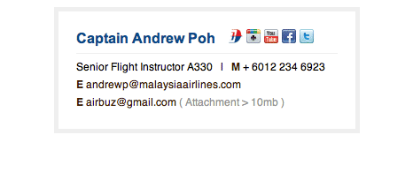


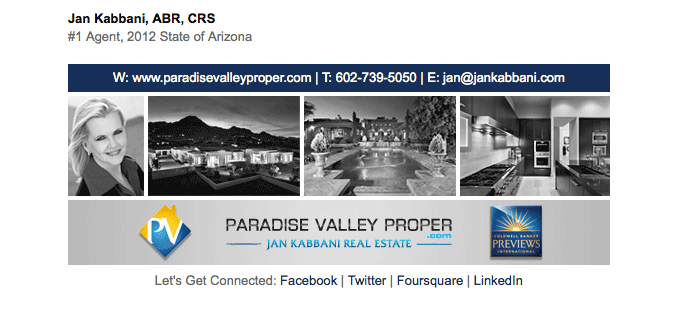
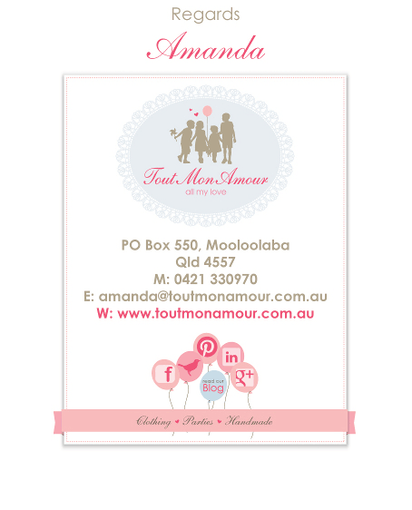
Image on Bottom ***Click on image to see sig design***
Image on bottom, info on top is also a great option if you are looking for a consistent and compact design. The layout is usually narrow since the info flows from top to bottom. Keeping the design layout narrow ensures better consistency when the email signature is viewed on smaller screen and on mobile devices. Another benefit of this option is when the image is blocked and cannot be viewed, the design will still look good.


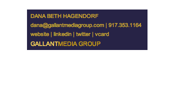

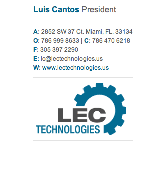

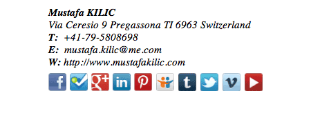

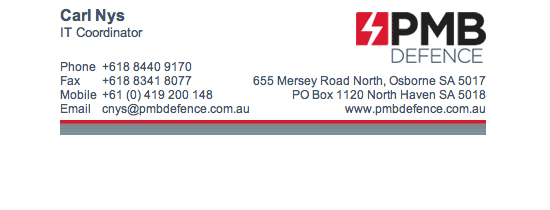
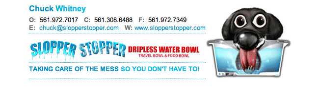
Image on the Right ***Click on image to see sig design***
A long layout usually results from this option. It can look awesome but doesn’t work for all people. Works great for those who deal with emails mainly on a computer and may have legal info that must be inserted below the signature.


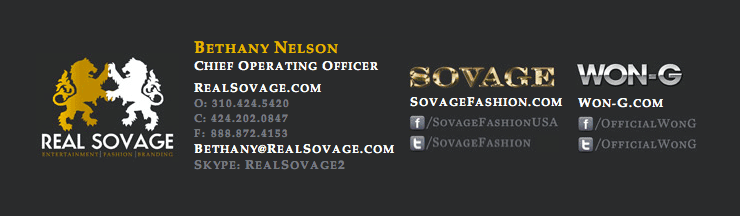
Custom Layout ***Click on image to see sig design***
We sometimes do custom designs for customers who have very specific needs. Custom layouts are sometimes necessary for custom jobs. It doesn’t work for all but for some, this is exactly what they need to get their job done right.